“A love of letters is the beginning of typographical wisdom. That is, the love of letters as literature and the love of letters as physical entities, having abstract beauty of their own, apart from the ideas they may express or the emotions they may evoke.”
John R. Biggs
John R. Biggs
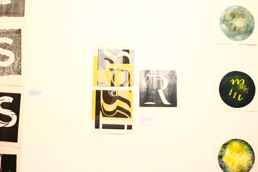
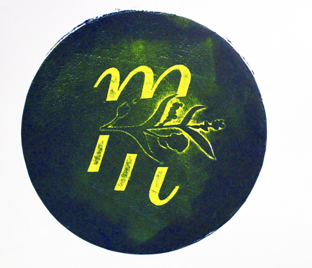
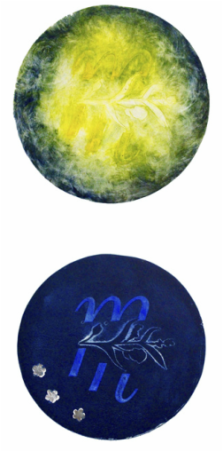
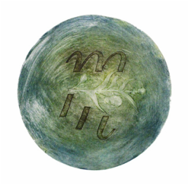
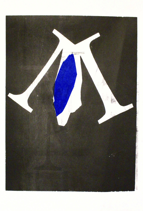
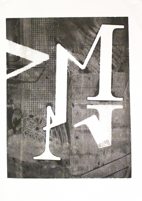
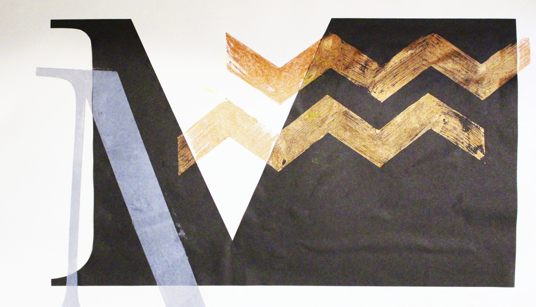
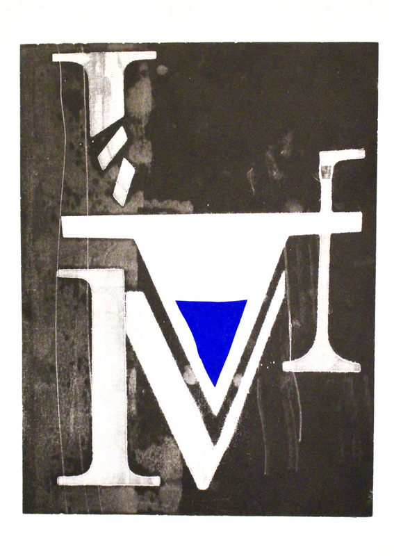
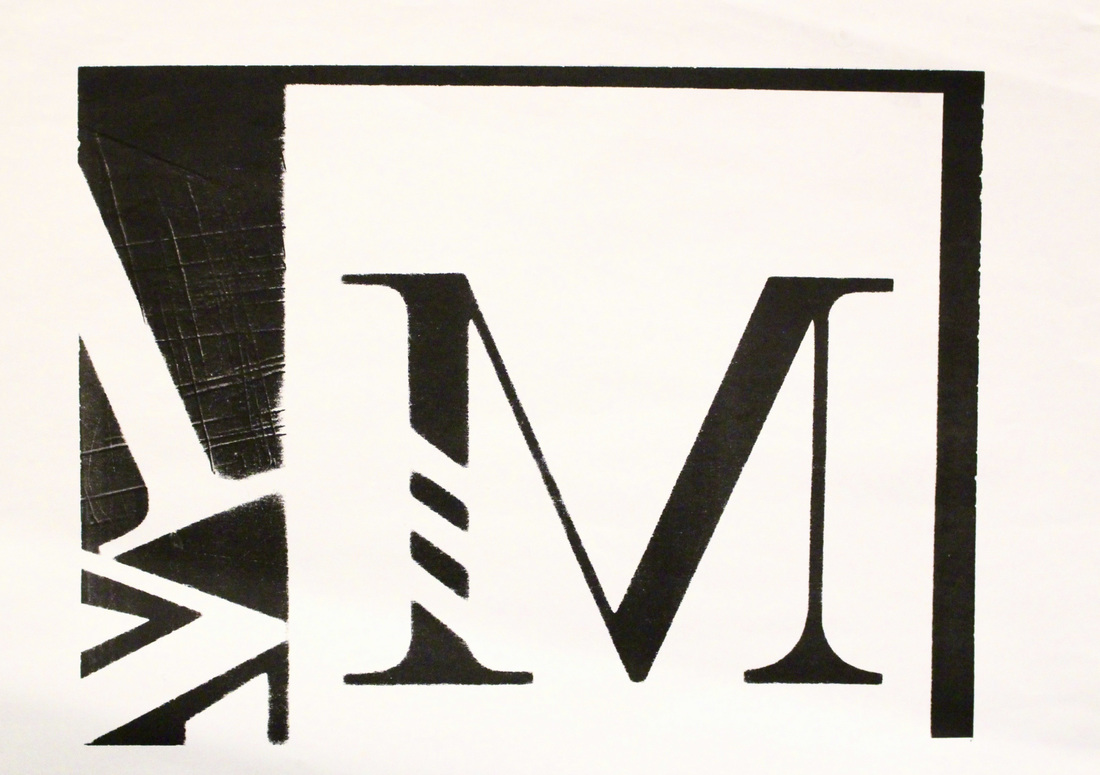
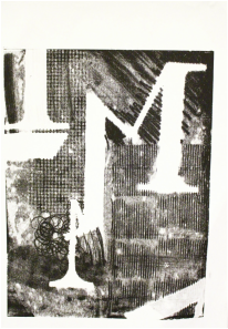
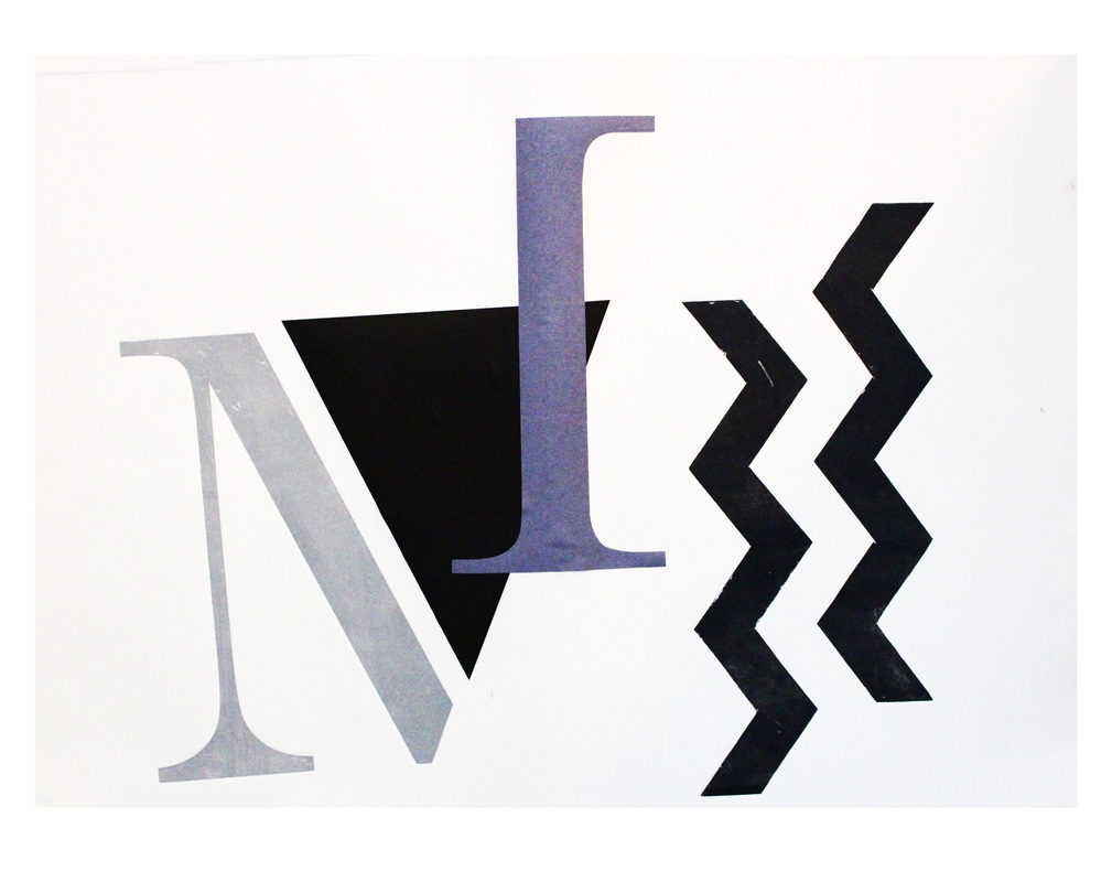
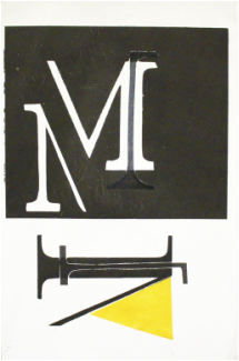
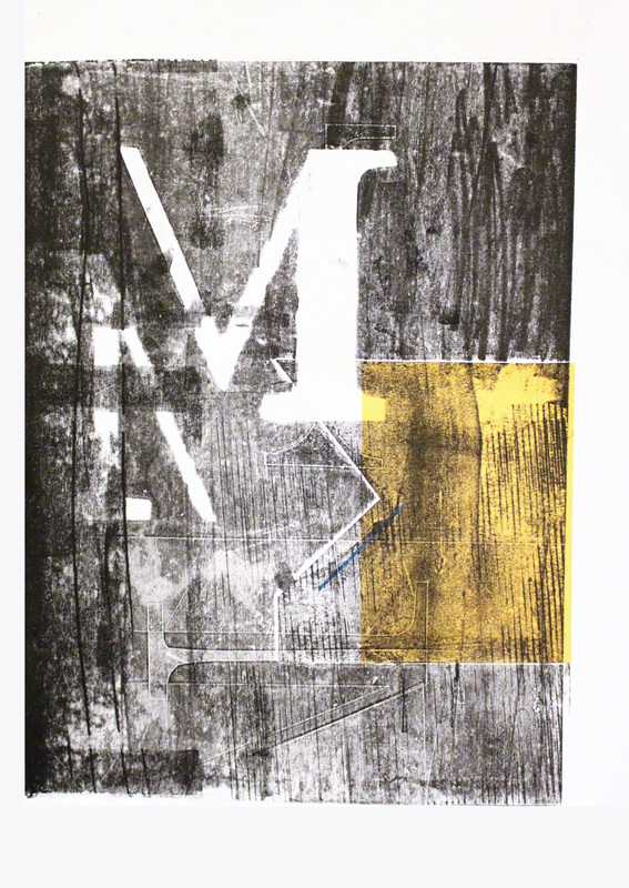
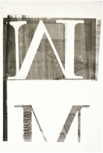
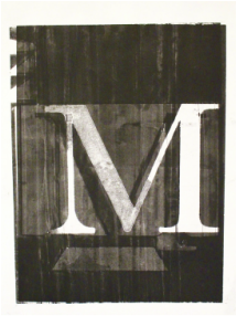
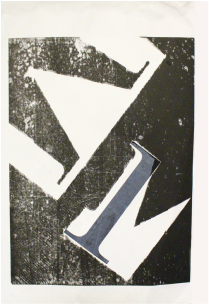
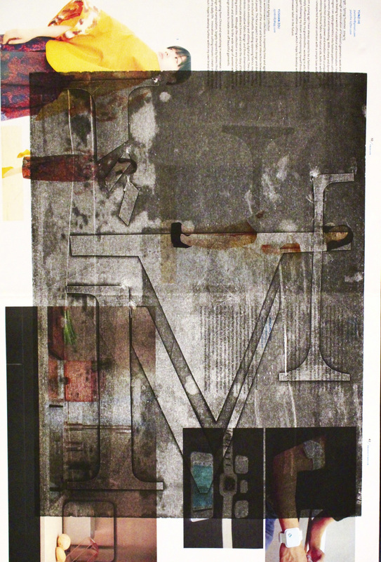
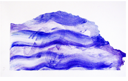
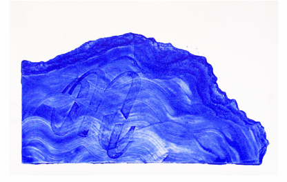
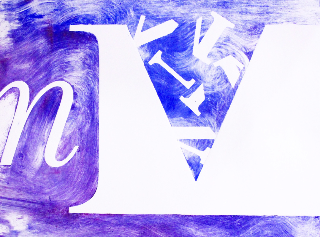
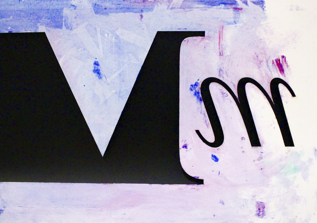
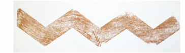
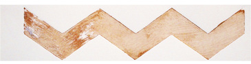
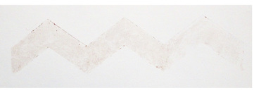
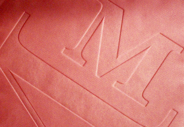
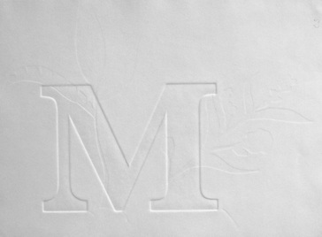
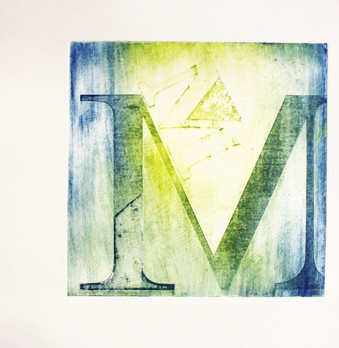
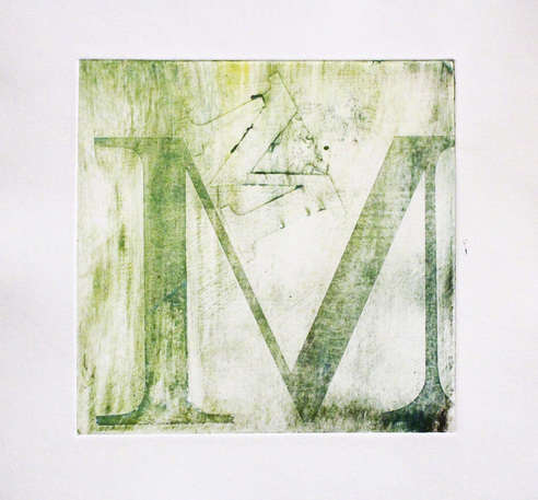
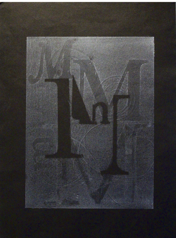
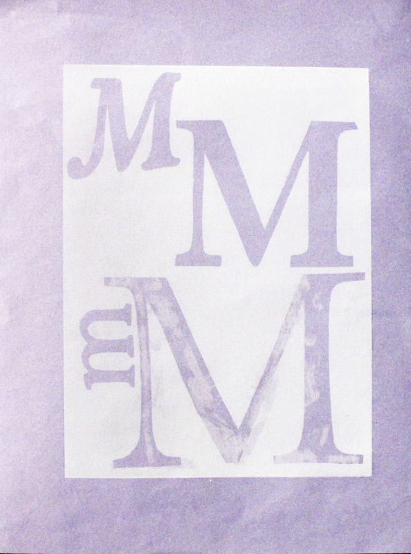
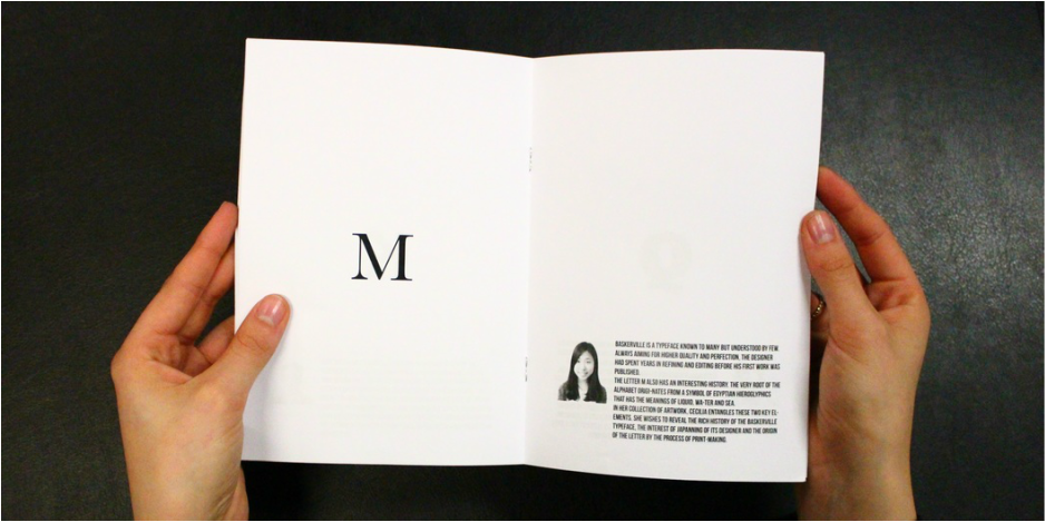
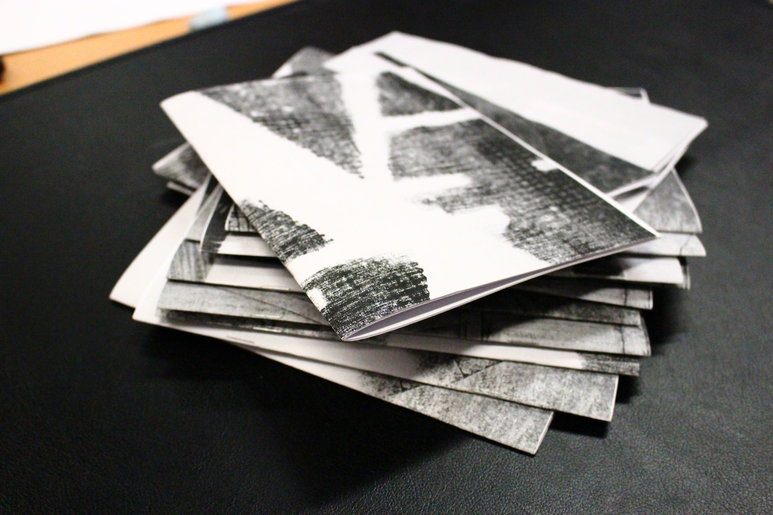
This is one of the project assigned by the uni. The project allow us to study a particular letterform and typeface through the process of printmaking and playing around with the deconstruction / reformation / distortion of letters. My assigned letter is M and the typeface Baskerville Regular. A group exhibition coordinated by us all first-years together with our tutor finishes the project. Below are the samples from mono printing, chine-collé (thin paper collage), blind embossing and stencil.
|
|
|
|
|
|
|
|
|
|
|
|
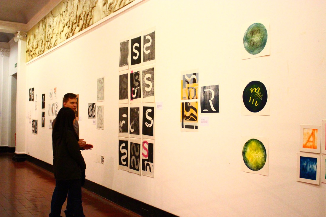
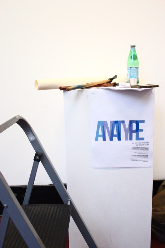
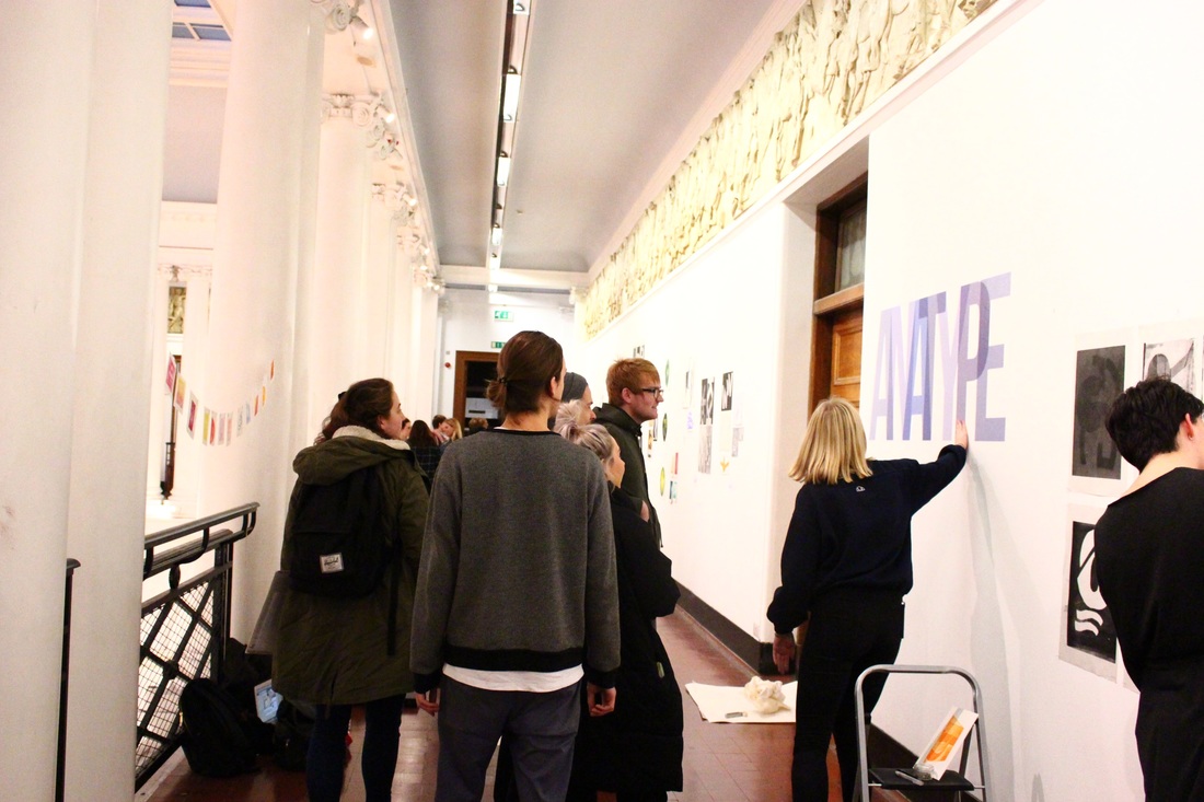
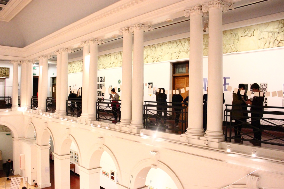
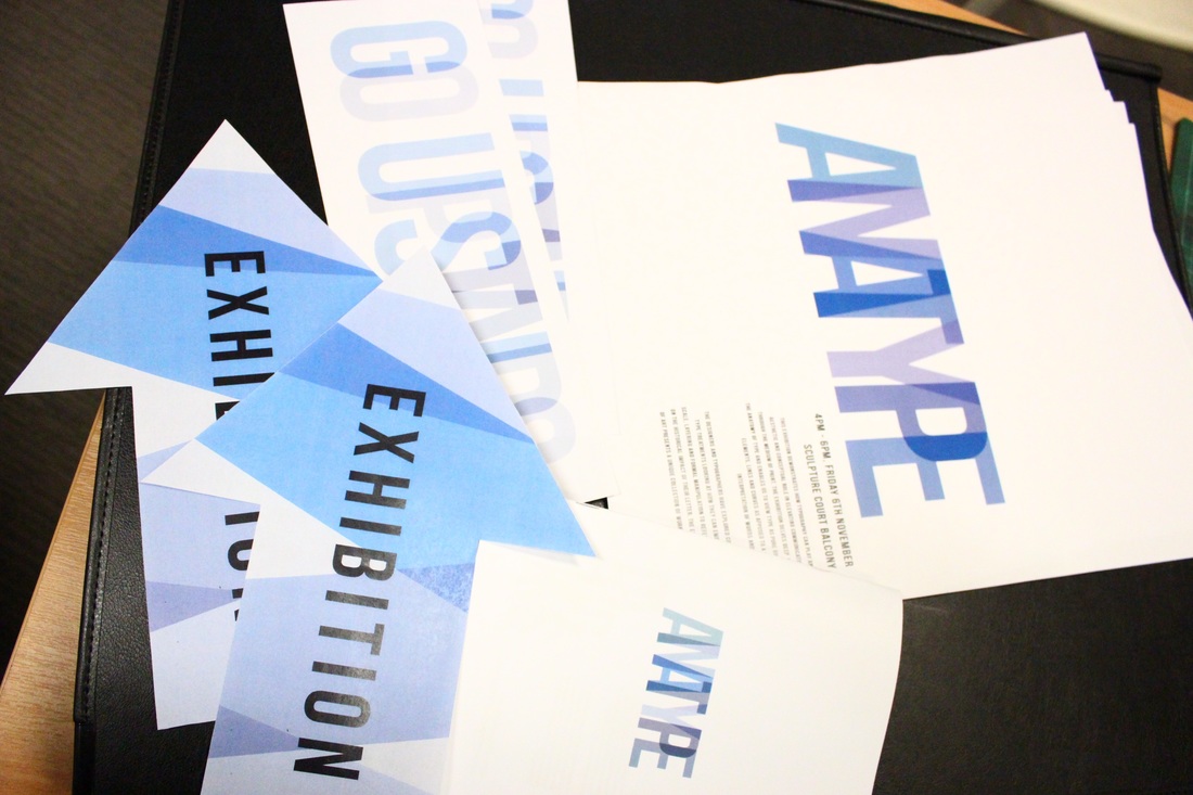
Here are some photos of the exhibition we organized.
|
|
|
|